



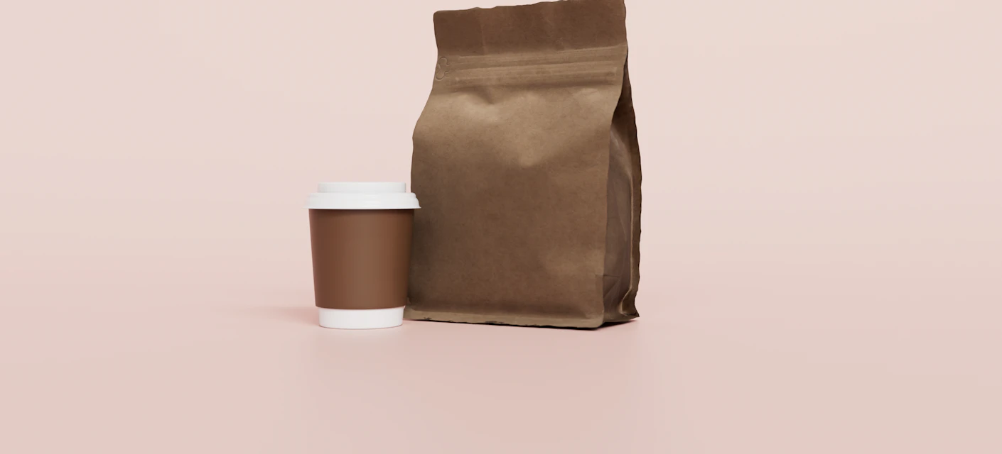
Coffee bag and takeaway cup packaging on a pink background

Brand
identity

A concept brand identity for an independent coffee roaster: a name-ready logo system, warm color palette and packaging designed to stand out on a crowded shelf.

Type:

Concept project

Services:

Branding & packaging

Industry:

Food & beverage

Deliverables:

Logo, packaging, guidelines

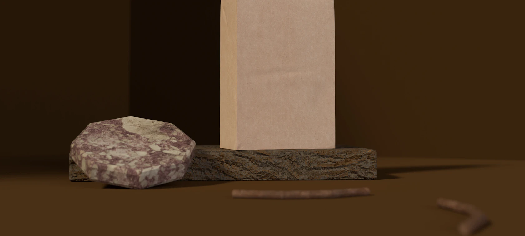
Kraft coffee bag packaging on a dark background

A Warm, Confident Identity For A Small-Batch Roaster

Specialty coffee is a crowded category where most bags look alike. For this concept we set out to design an identity that feels crafted and approachable without leaning on the usual kraft-paper clichés. The work started with positioning: who the roaster is for, what makes the product different and how the brand should sound. That thinking shaped every visual decision that followed.

The result is a flexible system built around a simple mark, a restrained palette and packaging that carries origin and tasting notes clearly. It works on a 250g bag, a takeaway cup and a social media post alike.

  • Logo suite and brand mark
  • Color palette and typography
  • Bag, cup and label packaging
  • Brand guidelines document
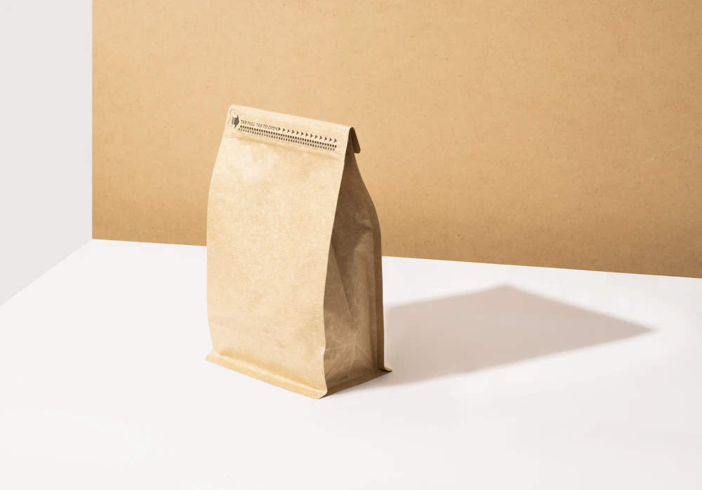
Kraft paper coffee bag on a white table
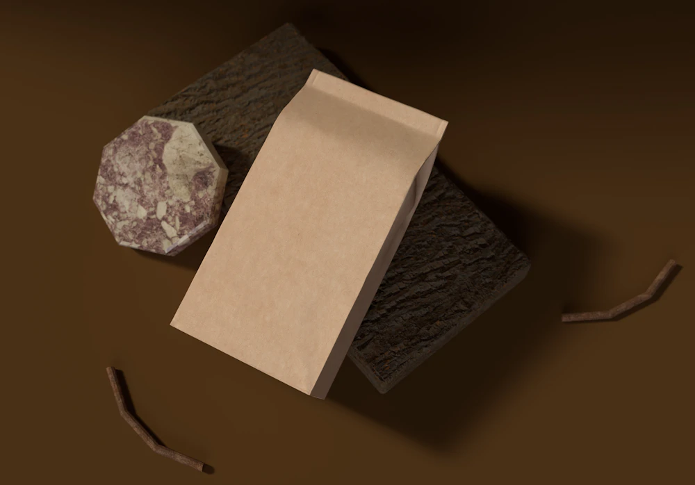
Coffee bag packaging lying on a dark surface

From Positioning To
Packaging.

01

Brand discovery

We defined the audience, competitors and personality the brand should own before any design began.

02

Creative direction

Moodboards and two visual routes were explored, then narrowed to one direction with a clear rationale.

03

Identity design

The logo, color palette, typography and supporting graphics were developed into a consistent system.

04

Packaging rollout

The identity was applied to bags, cups and labels, with print-ready artwork and usage guidelines.

The Outcome

The finished concept gives a small roaster the tools of a much larger brand: a recognizable mark, packaging that explains the product at a glance and guidelines that keep everything consistent as the range grows.

This is a concept project created to show our branding process. It was not produced for a paying client.