



Brand
identity
A concept brand identity for an independent coffee roaster: a name-ready logo system, warm color palette and packaging designed to stand out on a crowded shelf.
Concept project
Branding & packaging
Food & beverage
Logo, packaging, guidelines
A Warm, Confident Identity For A Small-Batch Roaster
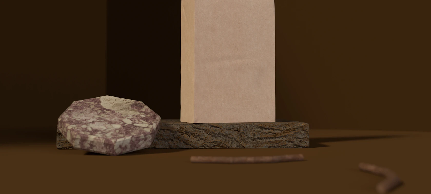
Specialty coffee is a crowded category where most bags look alike. For this concept we set out to design an identity that feels crafted and approachable without leaning on the usual kraft-paper clichés. The work started with positioning: who the roaster is for, what makes the product different and how the brand should sound. That thinking shaped every visual decision that followed.
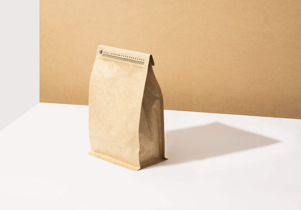
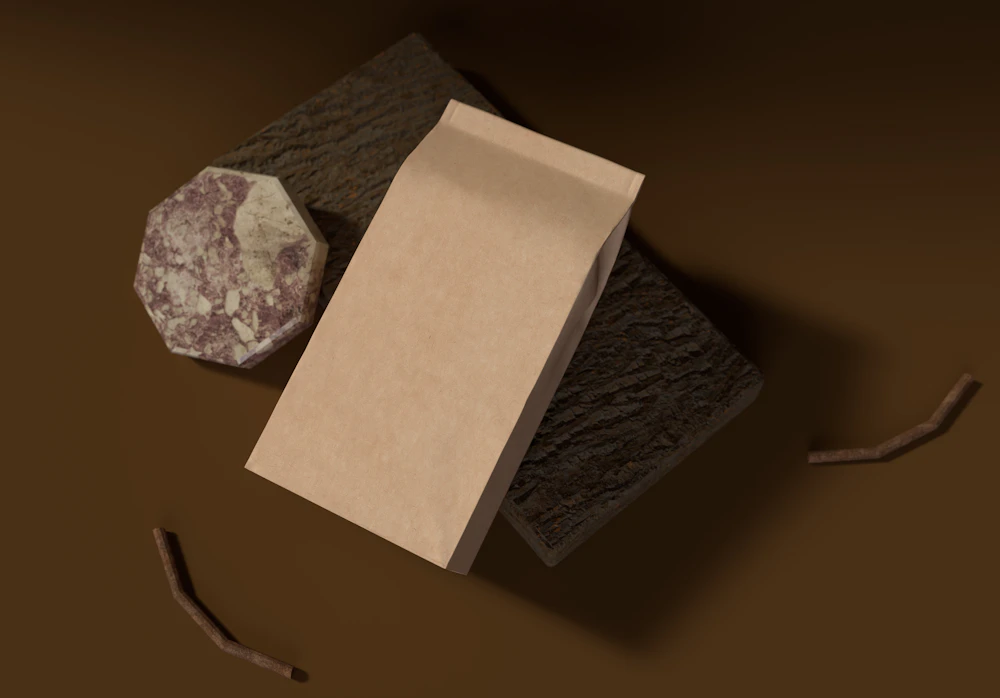
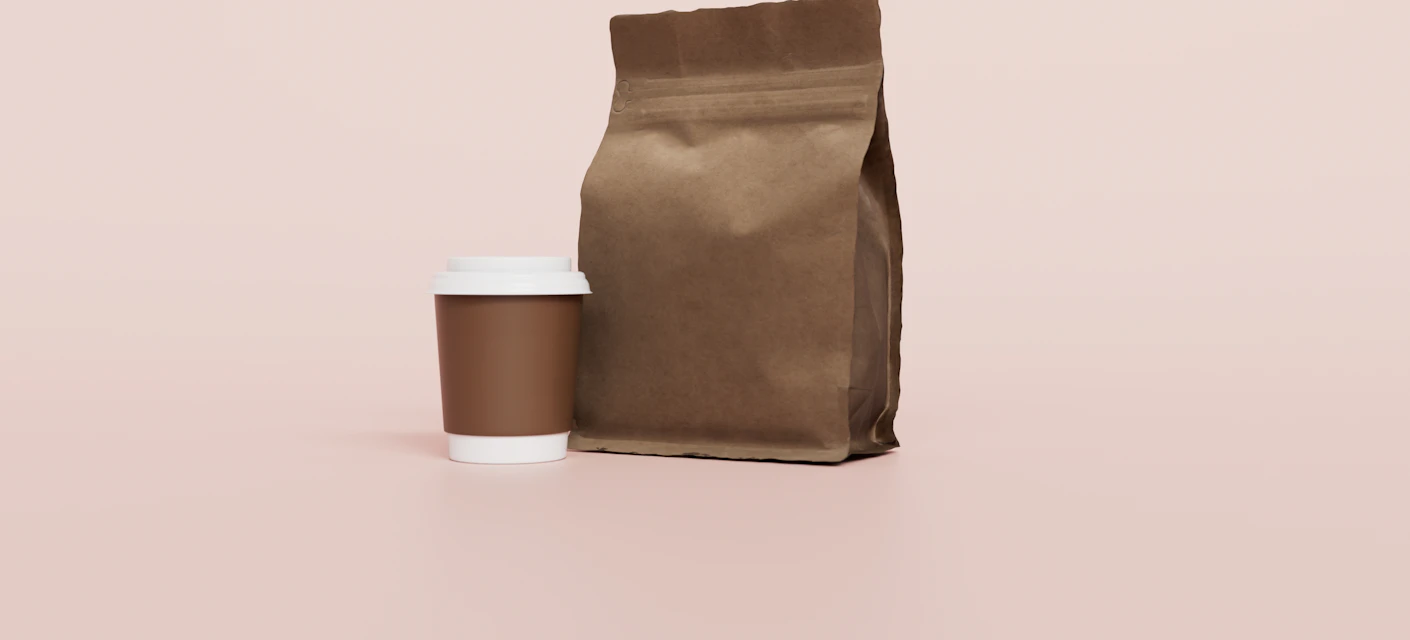
The result is a flexible system built around a simple mark, a restrained palette and packaging that carries origin and tasting notes clearly. It works on a 250g bag, a takeaway cup and a social media post alike.
- Logo suite and brand mark
- Color palette and typography
- Bag, cup and label packaging
- Brand guidelines document